

UK wellbeing - how are we doing?
- Elliot Fern
- Aug 4
- 3 min read

Updated: Aug 6
When people ask how the UK is doing, the conversation usually turns to inflation, GDP or unemployment.
Those numbers matter, but they only tell part of the story.
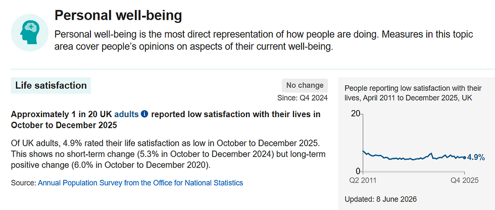
The Office for National Statistics publishes one of the most interesting datasets in the country. Its UK Measures of National Well-being Dashboard brings together around 60 indicators covering everything from health and personal finances to relationships, the environment and trust in government. Instead of asking whether the economy is growing, it asks a much bigger question.
How are we actually doing?
You can explore the dashboard here:
As someone who works in market research, I find this far more interesting than economic headlines. It recognises something researchers have known for years. Life is complicated, and no single number can explain it.
What stood out to me was that the picture is mixed.
There are areas where life has improved, while others have stood still or moved backwards. That shouldn't surprise us. People can feel financially secure but lonely. They can be physically healthy but anxious. They can enjoy their local community while having little trust in national institutions. The dashboard reflects that complexity rather than pretending everything moves in the same direction.
One area I keep coming back to is trust.
Trust influences almost everything. Whether we trust organisations, government, the media or charities shapes the decisions we make every day. Once trust begins to fall, it affects behaviour long before it shows up in traditional economic statistics.
Another observation is how important subjective measures are.Some people question whether asking someone how happy or satisfied they are is "real" data. I'd argue the opposite. If enough people consistently tell us they are less satisfied with life or more anxious, that is evidence. It may not tell us why, but it tells us something important has changed.
That's where research comes in.
Good research rarely stops at measuring a score. The interesting question is always, "What's driving it?"
A drop in life satisfaction could be linked to finances, health, relationships, work, housing or something else entirely. Without asking further questions, we're left with symptoms rather than explanations.
The dashboard also reminds us that averages can hide a lot.
A national figure is useful, but no two communities experience life in exactly the same way. Younger adults, older adults, parents, carers, people living in rural areas and those in cities may all have very different experiences. National data is a starting point, not the final answer.
Perhaps my biggest takeaway is this.
Too often we judge success by what is easiest to measure. Economic growth, employment and productivity are all important, but they are not the same as quality of life. If people feel disconnected, unhealthy or pessimistic about the future, those experiences matter just as much.
The ONS deserves credit for trying to measure the UK in a more rounded way. It isn't perfect, and no dashboard ever will be, but it encourages a much more meaningful conversation than simply asking whether GDP has gone up or down. The framework covers ten broad areas of life and combines objective indicators with people's own assessments of their wellbeing, giving a richer picture of progress.
As researchers, that's probably the biggest lesson of all.
The best decisions come from looking at the whole picture, not just the easiest metric.


